{Now also remember my photography skills are nowhere near Helen's}
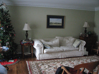
It's one of those long rooms that can be tricky with furniture-arranging.
My client's style is traditional and she was looking for sort of a fresh, comfortable "traditional"/ for their Colonial home. She's attracted to architectural drawings and Colonial fabrics and blues, and there's a real "Virginia" feeling about their house. We were keeping the existing end tables, chest and bookcase and everything else would be new (or atleast new for the space.)
For clients' designs, I typically start with a general floorplan and then get started on soft goods, which inspire me the most, and in this case it was the fabrics. I knew I wanted to do something fairly bold on the plan's settee, and I fell in love with this overscale floral chintz, "Hollyhock," by Schumacher:
From there we started pulling other fabrics to develop a general palette. We selected a combination of neutral velvets and some patterned linens & cottons. I spec'd a beautiful antique-washed wool rug that I'd seen the previous summer & couldn't get out of my mind.
Being so overscale, and being a floral, doing the Hollyhock on a settee was a stretch for my client, but I urged her to mull it over. It was our linchpin & I'd based the entire palette around it. If we switched the fabric to a safer one, I knew the results wouldn't make her as happy. {Presenting plans with a bit of "risk" in them to your clients can be challenging. I think a designer's job is to push his or her clients a bit outside of their box, but not so far that they don't love the end results. It's walking this line that creates a room clients really love... I find that lots of clients push back a little on one or two presented items, which I think is good. On items like these, I like to give my clients time to think & let the new idea sink in before we axe it all together. Sometimes it just takes finishing up the presentation and sometimes is takes weeks to get used to an unexpected idea, but I feel that we all need to go a bit outside of our comfort zones a bit in our homes to get a really special result that will excite us... } My client was very willing to think on the fabric and I was thrilled when she decided to go for it.
Here's one last pic of what the living room looked like before:
And here it is now:
We rearranged the long room so that the sofa now faces the windows and a pair of chocolate-milk-colored velvet wing chairs. The walls were painted a soft cream to lighten up the space and we had a seagrass rug custom made (by Tolvin at the Carpet Customizer- he's THE BEST) and layered the antique-washed wool rug over it.
We layered the coffee table with a wooden tray holding pretties like this clay pot by Lindsey Augustine, a pair of old brass candlesticks, and an "M" candle:
I placed a large console behind the sofa and used a pair of blue lamps by John Rosselli on top:
{The basket under the table holds a coiled snakeskin my clients found}
There are a couple of areas we didn't get photos of. I layered in artwork - both new & old (found at Spurgeon Lewis Antiques in Old Town/ 1st Dibs). I also created a gallery wall of my clients' collected family photos. It's such a large wall & it has photos that span years so it really tells a story about them & who they are. Here's a close-up of the neutral/ wheat-colored fabrics on the english arm sofa:
{The pillows are by Schumacher and the paisley throw is from my line of textiles}
This next photo is my favorite one. I had this image in my mind long before the room even came together & was so excited to see it in person!!
(A couple of weeks before the room was installed -ie months after we'd ordered the furniture & selected the fabrics, I was looking through old House Beautiful Magazines and I came accross a project by Albert Hadley titled "Colonial Design" using this exact same fabric 40 years ago in a living room and reusing the same pieces again in a 2009 project when the same clients moved to another Colonial... I was at once both thrilled and disappointed. Thrilled because it's Albert Hadley and because I got the instant gratification of seeing what the fabric would look like on a settee when before, I'd only imagined it, and disappointed because I felt extremely unoriginal & slow on the uptake.)
Anyway, here's what the foyer looked like before:
Small drawings were placed around the foyer on different walls.
And here's an after shot:
I reunited the collection of drawings all in a row above the chair my client found. We restyled the table/ print in the background for this shot because we couldn't get a good one of them in their original position. (I've learned so much working with Helen!)
Without knowing about the Hadley project, F.J. dubbed the project "Colonial Chic" which is hysterical, especially if you knew F.J.
Anyway, I hope you liked the before & afters, and getting details of the in-between.
Thank you so much to my very patient clients who were a dream to work with!
Have a great SUMMA weekend!
We're taking on new clients for this Fall! If you'd like help creating a home you absolutely love, contact me about our design services. We work locally around the DC area and travel for select projects. :)


No comments:
Post a Comment