I thought I'd give you an update on what we've been up to at our new house & share some plans for our family room.

Above, our yard is finally getting there... The flowers are getting big enough for cutting and my husband built a pretty fence around the property. Life is so much easier without having to worry about our toddler & dog escaping to freedom! (We're waiting for it to gray/ dull a bit with age)
My husband's been working like crazy...And Christian has to do everything his dad does... He has to "help daddy" as he so urgently tells us, so here he is below, shoveling and "making a garden."

Below, our favorite spot to hang is under the maple tree in our two adirondack chairs. The other night, after transplanting an entire truckload of plants from my mom's garden, (thank you mom!!) we put the little one to bed & just sat out in the chairs. It felt so good because we've been running around like crazy and it was awesome to look around & see all that we'd accomplished. Writing this now, I realize we need more of this relaxing time...

Our little guy's having so much fun out there & we have one of those really ugly bright plastic baby pools with the slide in them. He absolutely loves it, which is enough to make me not care about how bad it looks.

Our friends, Amy & Greg, made us this awesome vegetable garden!! (below) Yes, they actually came over & built it & gave us plants & everything. I can't believe how sweet they are & can't wait for those 'maters to grow!! yum! yum!

We've picked the paint color for the outside of our house, the gray below, and hope to get to it in the next couple of weeks.
And finally, my in-laws came this weekend to help again. yay!! My husband & father-in-law removed all the panelling in the basement/ family room, waterproofed it, changed some walls, added new insulation & put in a new drywall ceiling to replace the drop ceiling. We're closing up the walls today with paneling & will be carpeting the floor.
 The sofa will go on the left wall:
 And the hutch will go on the other, for the TV & toys:
 Below is where I'll be putting my office. (The sofa pictured will be reupholstered & going upstairs.)
 I think I'll use a table as my desk that can double as an eating & game area: (image from Country Living)
 Below is another view of the room. OH SO PRETTY!!! hahahaha We have a woodburning stove that we'd eventually like to replace with an actual fireplace.
 I plan to put two cozy chairs & an ottoman in front of it: (image below from Cottage Living)

Below is the cottage by Ruthie Sommers from House Beautiful that I recently posted on. I really fell for the color on the walls & we've already bought the paint. (I went a bit lighter than the actual paint shown but it looks the same- funny how photos work like that.) It looks awesome on the paneling. (It's much brighter than I usually go for but I wanted a fun, casual, bright vibe down there & I'm excited for a change.)

 Here's another image from Real Simple, with a similar color scheme. I'm loving all the pops of white:

So, there you have it! I'll post after pics as soon as I get them!!! So, do you have any projects planned for summer??
xoxo,
lauren
 I just ordered our new dining room chandelier!!! It's made from coconut beads and is half off at Anthropologie. It reminds me a bit of Nina Griscom's ($5000) branchelier:

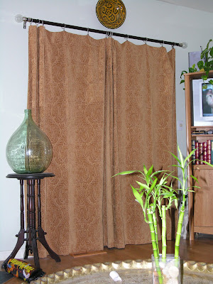 Images with flash end up being dark & cold & cheap-looking. (above & below)
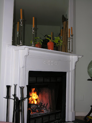 Now, check out the "after" (below). It's light & airy and much better:
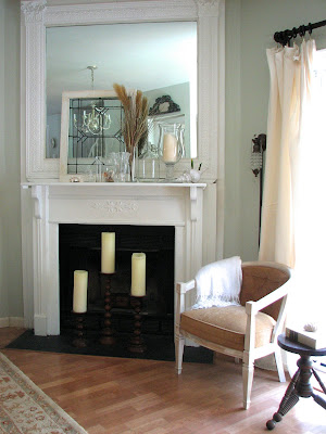.jpg) 2) Shoot during the day when the lighting is good. (Unless you're specifically after nighttime shots like a Christmas tree at night or candles or something special like a city view.) Here is our living room when we first moved in. (With all of my lovely decor from my old apartment... eeeeeek) I didn't use flash on it even though it was taken at night: (which is good)
2) Shoot during the day when the lighting is good. (Unless you're specifically after nighttime shots like a Christmas tree at night or candles or something special like a city view.) Here is our living room when we first moved in. (With all of my lovely decor from my old apartment... eeeeeek) I didn't use flash on it even though it was taken at night: (which is good) But check out the difference in the same room during the day: (no flash of course)

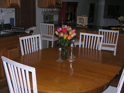

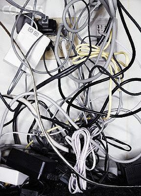 Styling for the kitchen: Sometimes people actually go too sterile when photographing kitchens. But, remember you can ditch items like your toaster (if it's not cute & takes up too much space), sponges, pot scrubbers, pens & pencils, etc. Consider having a pretty soap dish or dispenser, nice towels, good-looking cooking utensil holder, a bowl of fruit and/ or vase of flowers.

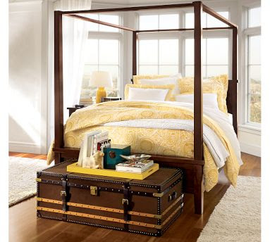 Show personal, but not-too-personal-items that make the space look lived in: NOT the box of tissues but maybe a cool glass of water in a vintage glass or a pair of glasses on a stack of pretty books..
 Pottery Barn is awesome at styling in my opinion. I might not always be in love with what they're selling but I'm always so impressed with their styling. (above) For dining rooms, make sure there's something beautiful on the table. It doesn't necessarily have to be a set table (which does look gorgeous) but it could be something simple like a pair of lanterns or dinnerware stacked up as if it's about to be set with a little vase of fresh flowers.


 To begin with, let me tell you that I was aware that a home should have flow with colors & a tone that relates to one another throughout the rooms, but I totally disregarded this because I knew I would only be living there for a short time & I wanted to go crazy with colors, to experiment. And experiment I did...

 We painted the kitchen in a terra cotta and (here's where it gets bad) the dining room in BLUE. hahaha oh well... talk about flow! The rooms were fairly closed off from one another but from one point in the entryway, if you looked just right you could see all 3 colors at once. I kid you not, I kind of loved it & would stand there to see all 3 colors at once, telling my roommate, "Oh look! If you stand here it's like a rainbow!!!" hahahahaha

 We also knocked over an entire gallon of paint on the white carpet and had to rip it out to expose the hardwood parquet underneath. Now, this was an apartment and when this happened, I did not expect to get my deposit back, but they did give it back!! WOW love them!

 When I painted the bedroom & bathroom a pale blue & got the Bombay bed, I would say it was at this point that I started getting a sense of what was "me." I repainted my bathroom a pale blue to match the pretty toile shower curtain I got from Restoration Hardware at a wedding shower. (below)


 Below, our favorite spot to hang is under the maple tree in our two adirondack chairs. The other night, after transplanting an entire truckload of plants from my mom's garden, (thank you mom!!) we put the little one to bed & just sat out in the chairs. It felt so good because we've been running around like crazy and it was awesome to look around & see all that we'd accomplished. Writing this now, I realize we need more of this relaxing time...


 The sofa will go on the left wall:
  And the hutch will go on the other, for the TV & toys:
  Below is where I'll be putting my office. (The sofa pictured will be reupholstered & going upstairs.)
 I think I'll use a table as my desk that can double as an eating & game area: (image from Country Living)
 Below is another view of the room. OH SO PRETTY!!! hahahaha We have a woodburning stove that we'd eventually like to replace with an actual fireplace.
  I plan to put two cozy chairs & an ottoman in front of it: (image below from Cottage Living)

 Here's another image from Real Simple, with a similar color scheme. I'm loving all the pops of white: