It's not styled & I just snapped some photos really quickly, but I thought I'd share with you what we've got so far. Here are the before photos:

This photo doesn't do this rug justice. It really is pretty & we moved it to a more prominent spot in a stairway.

Below is the dining room before. Our goal was to update it & lighten up the space and make it feel more grand in a comfortable way.

So here it is now:

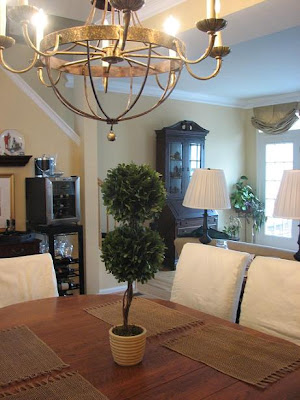
We purchased new oatmeal-colored linen slipcovers with adorable box pleats for parsons chairs she already owned and purchased a few more for around the whole table.

Below is a sneak peak at the living room, which we're finishing up right now:
Here's the chandelier that I really think makes the space. It's totally my client's style & its overscale size was needed to dilineate the dining room & from the living area & to keep it from getting lost in the open-plan living room/ dining room.

Here's a closeup of the hutch. An old friend made it for her!!!! WOW, It's just beautiful & you wouldn't believe the craftsmanship!!

How pretty is this little porcelain basket of hers?

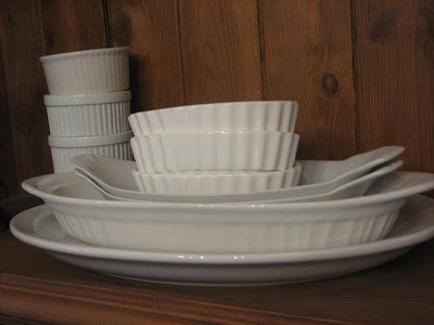
I loaded the hutch with all of her whiteware for a light look for the spring & summer & when she feels like it she can switch it out with other colors:


Here's a close-up of the sconces. Love those beads!!

And finally, one last picture of the room: You can really see how a few small details- lighting, seating and accessories- can have such a huge impact!!
 hope you enjoyed!!
 hope you enjoyed!!
xoxo,
lauren

No comments:
Post a Comment