Now I need to describe this kitchen to you very carefully because I don't have the best 'before' pictures of it:

So here goes: The walls were tiled 3/4 of the way up with pale yellow tiles from the 50s (you know those tiles that are in school bathrooms & have the netting behind them??) and edged with HUNTER GREEN bullnose. The rest of the walls were painted a really dark hunter green to "match" the tiles.
 The counters were the original ones from the 50s (I actually liked them with the stainless steel frame) and the backsplash was the yellow 50s tile with the green tile running through it. eeesh! The kitchen was dark & closed-in-feeling and did not make you want to linger. It felt like the walls were closing in all around you. (I can say these terrible things about the kitchen because I know my mother-in-law, Sharon, has even stronger feelings about the kitchen than I did & will not be insulted.)
Anyway, here are some pictures of the kitchen now:

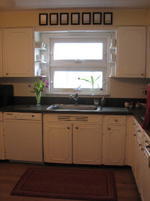
We had the wall painted with Benjamin Moore's "Whyndam Cream" to add a little more sunshine to the room and the tiles were painted white. (Amen!) Sharon is one of the most cheerful, happy & warm people you could ever meet & I knew she needed a kitchen that reflected her personality. The goal was to get the kitchen feeling, clean, happy, homey with a hint of that cottage & old-fashioned charm Sharon loves (without spending much!) They replaced the countertops with gray formica which works really well. (Althout I was said to see the original ones go!!) Once the walls were painted, the hutch was next. (She's been planning on painting her forever!) Here's a photo of it in their old house 10+ years ago:
Here it is now, just finished, with a few coats of Benjamin Moore's 'Shaker Beige' on it and filled with her beautiful red & gold china:

I've always loved this antique pitcher she has (below) and it looks perfect to me filled with these sunny tulips:

The shelves above the sink housed knick-knacks & made the kitchen feel cluttered (below):

So we replaced the knick-knacks with functional things like mugs, cups & the salt & pepper shakers. (and of course, I love all the white!!)
 Below is a picture of the kitchen after the paint job but before the mini makeover. The apple clock hides an unsightly outlet but was not okay with me ;) (below)


So we replaced the knick-knacks with functional things like mugs, cups & the salt & pepper shakers. (and of course, I love all the white!!)
 Below is a picture of the kitchen after the paint job but before the mini makeover. The apple clock hides an unsightly outlet but was not okay with me ;) (below)
So down came the apple clock & up went some picture frames Sharon had lying around. The plan is to fill them with black & white photos of the family (we didn't get to that part yet, as I only had 1 day!!-- future pics to come!! ;) But it really updates the look (below) inexpensively by adding a little graphic punch:

Below is a 'before' picture of the eating area:

We brought in these french country chairs & hung (ok, taped :) a pretty antique tray that Sharon already had on the wall.


Here's a pic of the cabinets we painted white, which are original to the house. We're bringing this color scheme (red, cream-yellow and gray) into the neigboring living room for a beautiful makeover(to come!).

We put up some family photographs to make the room feel personal & homey & add in some more black, and I couldn't be happier with the tile now!!!


The tray picks up the colors from the plates in the hutch & brings in some of that "old fashioned pretty" that Sharon loves so much. (She also loves shots of black.)

Here's a pic of the cabinets we painted white, which are original to the house. We're bringing this color scheme (red, cream-yellow and gray) into the neigboring living room for a beautiful makeover(to come!).
Here's a closeup of the great little white cannisters Sharon scored at a thrift shop :

We put up some family photographs to make the room feel personal & homey & add in some more black, and I couldn't be happier with the tile now!!!
Sharon is so happy with the results & my father-in-law, John, is happy as long as she's happy & there's not a lot of "clutter" and we didn't break the bank! Now the ktichen is as bright & cheerful as Sharon! (She'll probably roll her eyes when she reads this thinking I was going for brownie points! hahaha) Anyway, I'll be posting on their living room soon- I cannot wait!!!
xoxo,
lauren


No comments:
Post a Comment